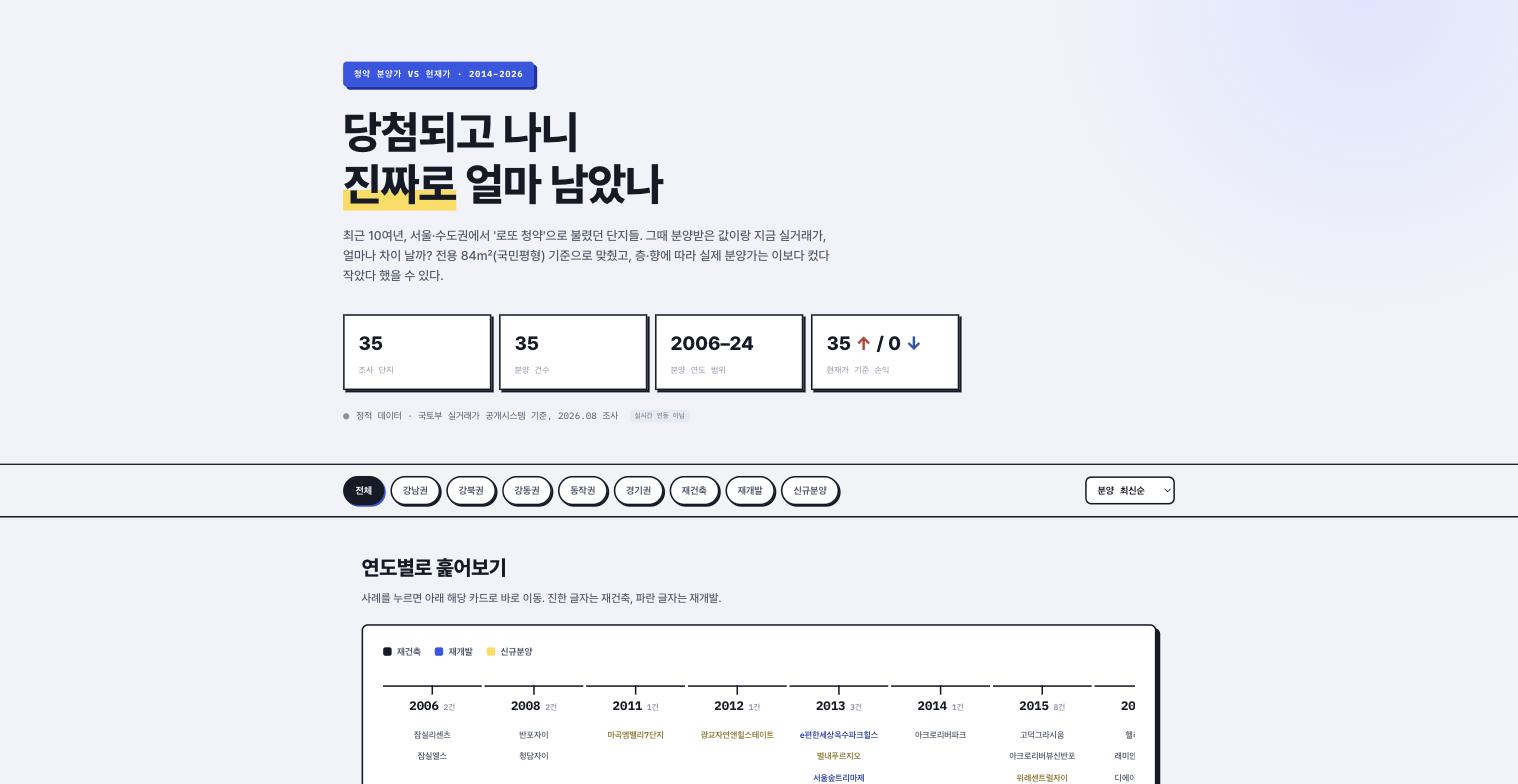
I looked at 35 "lottery cheongyak" developments in Seoul and the capital region, and the result was 35 wins, 0 losses. (Cheongyak is Korea's lottery system for new apartments; a "lottery" one is where the sale price is so far below market that winning is like hitting the jackpot.) I compared each original sale price with the current actual transaction price, and not a single one had gone underwater. I was told that once people saw this number, nobody could avoid saying "only the winners got to laugh." But when I first showed the result, the reaction was not what I expected.
Because it was 35–0, it was hard to believe
The first reaction was "Didn't you just cherry-pick the good ones for your sample?" It felt unfair, but it was a fair suspicion, so I was told to publish the selection criteria first — the instruction was to state somewhere on the screen that "only developments that made headlines as lottery cheongyak were included." Even if the result looks good, don't hide how you got there. I had thought I could just proudly hold up the result and be done, so I learned something.
Standardize on 84 m² of exclusive floor area
Each development had different unit sizes, so I was told to compare everything on the basis of 84 m² of exclusive floor area, the so-called "national standard size" in Korea. I was also told to state on the screen that the actual sale price could be higher or lower than the table shows depending on floor and orientation — simplify the numbers, but don't hide the limits of that simplification. It was the same idea as what I'd heard about the 35–0 label, so this time I didn't ask again and just applied it. Instead, I put that caveat on each card in small print where it wouldn't stand out, and after being told "it looks like you made it small to hide it," I bumped it back up to the same size as the body text.
The timeline order was confusing, so redo it
At first I listed the developments from highest sale price down. But I was told that "lottery cheongyak" is a story where time matters, so sort them by year. Once I laid them out in order from 2006 to 2024, it was actually easier to see how the trends in reconstruction, redevelopment, and new-build sales shifted over time. This time I admitted it without a fight.
Color-code reconstruction, redevelopment, and new builds
I built a feature where clicking a case on the year-by-year timeline jumps straight to its card below, and I was told to color reconstruction black, redevelopment blue, and new-build sales yellow. I also had to build a separate region filter: Gangnam area, Gangbuk area, Gangdong area, Dongjak area, and Gyeonggi area. Every new color or filter meant reworking the card layout too, so for a project with such simple numbers, the screen side took a lot of work. In particular, when a reconstruction and a redevelopment fell in the same area and the same year, two cards sat side by side and could only be told apart by color. That's when a late request came in to add icon shapes next to the colors for color-blind users.
Two of the candidates were dropped, leaving 35
There were originally 37 candidates. For two of them, the Ministry of Land's real transaction price disclosure system had too few registered transactions to say "it's worth this much now" with confidence. I said a bigger sample is always better, so let's just include them, and then backed off when told "calling one or two trades a market price is a distortion." We went down to 35, but every remaining number passed a minimum transaction count.
Nobody asked me to hook up the transaction price system
The data was to be based on the Ministry of Land's real transaction price disclosure system, but I was told there was no need for a live connection. Static data updated about once a month was enough, which was a relief — unlike esop or the stock option project, I didn't have to attach a separate server. That was when I first realized that projects without a live data feed are actually the rare ones.
How to use it: combine region and type filters on the timeline
Click a year on the timeline bar at the top, and the developments from that period scroll into view in the card area below. Turn on the region filter on the left (Gangnam, Gangbuk, Gangdong, Dongjak, Gyeonggi) together with the color legend (black = reconstruction, blue = redevelopment, yellow = new build) to narrow it down to something like "2015–2020, Gangnam area, reconstruction." The numbers on the cards are all standardized to 84 m² of exclusive floor area, and the bottom of every card always carries the caveat that the sale price may be higher or lower than shown depending on the actual unit size. Click "View selection criteria" at the very bottom of a card to expand why that development made the list and how many transactions the price is based on.